One of the main characteristics of the therapeutic garden is that all persons feel autonomous in the garden. Autonomous to move around and participate independently of fragility and reduced capacities, from physical strength to cognitive impairments. To easily interpret and understand a garden is to feel that one has control when finding different places in the garden and understanding the signs, or to stroll around in the garden without feeling afraid of becoming lost. This chapter aims to explain how to help the users of the garden orient themselves and understand the lay out through some different design theories.
There are three major overlapping design principles or schema for the design of healing gardens. These are: natural mapping (Norman); latent image elements (Lynch); and housing zones (Zeisel).
Naturally mapped environments and objects are those in which all the information needed for their use is designed into the object or environment itself. No instruction book, map or memory is needed to negotiate the environment or figure out how to make the object work. A naturally mapped environment is one with a few clearly recognizable pathways that can be seen from anywhere in the setting, with an entrance and exit that everyone can see and understand as such, and with destinations that users of the environment can see easily. One that is not naturally mapped would have several forks in the pathways leading to destinations that are hidden around curves and bushes, would leave users in places with no clear way out and might even have paths that lead back on themselves without an indication of a way out.
The easiest way to use this theory is to try to create a “loop” in the garden that takes you through different planned zones. Sometimes when the site is narrow it is not possible to design a loop for examples rectangular terraces or along a building. Then it could be a good idea to plan a path along the site that ends up in a round plaza that ask the visitor to walk in a circle and then back through the same path. See pictures.
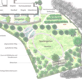
Imagen 33. Example orientation in therapeutic garden, Reuzzpark, Wädenswil, Switzerland. A “loop” leads to an orangerie and to a fruitgarden. Clearly passing through different zones and bringing the user back again. Before walking in the loop there is a small entrance garden along the building, indicating an intimate, small and safe garden.
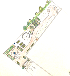
Image 34. Example orientation and way finding, terrace garden at Orxtaga residence, Bilbao, Spain. This site is too narrow to design a “loop”, so the winding paths been designed to end in a small plaza with a statue and benches. The circular form helps one move around and find the way back. (Design by Jardines Terapéuticos Palmlöf)
Another example of natural mapped environment is to carefully think of associations to the therapy or activity that this area is designed for. If one area is going to be used for social activities and family meetings it is a good idea to show this with lot of chairs and tables, perhaps a typical barbecue or bar or whatever is usually seen in the plaza of the city in the culture you are designing for.
Another example to help separate different activity zones and therefore assist with orientation, e besides walls and fences, is to use specific color codes or building material for this zone.
Latent image elements, defined by Kevin Lynch in his landmark study and book Image of the City on how taxi cab drivers organize information about the cities in which they work, include:
Paths: The channels along which people move; the predominant element in their
image of their environment as they move through it.
Edges: Boundaries between two areas; either penetrable barriers or seams that join parts of a garden together. Edges like the fence around a garden define and hold together general areas.
Districts: Sections of a garden that someone can enter into; recognizable as having a unique identifying character. This could be a horticulture place with pots, raised beds, watering tap and fruit trees.
Nodes: Nodes can be junctions, the crossing of paths or places of intense activity.
Landmarks: Reference points singled out from a host of possibilities in a setting:
towers, domes, signs, trees, doorways; “increasingly relied upon as a journey becomes more and more familiar”.
These five elements appear to be central to the way the brain processes environmental place information. Research has shown that landmarks play a central role in how people organize mental information for wayfinding – to develop their cognitive maps. Outdoor environments such as a garden can be fully described using these descriptive elements. In the therapeutic garden it is typical to use trees that draw attention by special colors or leaves. Perhaps it is a good idea to use landmarks associated to the different activity/therapy area. For example, an area for relax training, introducing bamboo fence to shelter as this often is associated with the Asian tradition and relax techniques.
The last theory of Zeisel is applicable when there is a residence building adjacent to the therapeutic garden. Zeizel defined the following housing ‘zones’ as natural organizing principles for residential settings.
‘Outsider public’ i.e. a park where everyone is welcome.
‘Insider public’ i.e. a residential street where everyone is free to walk, but those who live there keep a close eye on strangers.
‘Front personal areas’ are front gardens and lawns that belong to someone but are physically accessible, if, for example, a ball should bounce into them.
‘Building edges’ (front) include porches and front stoops that clearly are off-bounds for strangers with no business there, but are accessible
‘Back stage areas’ are represented by back yards where children play and people gather.
The significant characteristic of this spatial typology is that successful residential plans include all these zones, either by space or by some other defining element such as a change of grade with a hedge or a pavement or a fence.
Use of signals and maps
Signs usually have one of the following objectives in the therapeutic garden:
1. Share knowledge about something.
2. Help interpret the space, indicating where things are located
3. Guide those with vision impairment
1. Share knowledge about something.
This could be as simple as letting us know that we are located in a therapeutic garden. The use and the will to go out in the garden is connected to the awareness of the user and the professionals that the garden exists. There are several ways to improve this awareness, such as:
- Giving a name to the garden and create a sign with the name that is clearly visible.
- Signs with photos of gardens/plants already inside the buildings
- the garden “come inside” the building, putting branches and flowers inside
- Make sure the garden is clearly visible from inside through windows.
- Social and digital publishing
Another example of sharing knowledge is the by sharing a scientific or interesting fact with the visitors of the garden, for example: “Eating a bilberry is good for your health. Bilberry is one of the richest natural sources of anthocyanins; it lower blood glucose, it has anti-inflammatory effects, and lower oxidative stress” or “The pomegranate is a very old fruit, already mentioned in ancient Greece, where the fruit was a symbol of gods, such as Astarte, Demeter, Persephone, Aphrodite and Athena. The trees were planted on the tombs of heroes to make their lineage numerous, symbol of fertility because the fruit contains so many seeds”.
2. Help interpret the space.
This second purpose usually is divided in to three parts: pictograms to help people find the toilet, meeting points, water taps. Sometimes it could be necessary to put up a map to help people orient themselves. Designing a map that is easy to interpret is very, very difficult. Therefore, it is a better idea to use natural mapping as mentioned above. An idea is to use maps that incorporate little pictures to facilitate understanding. See picture below:
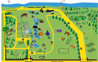
Image 35. If using a map to help persons with the orientation in the garden, try to include pictures to facilitate the interpretation.
Pictograms are very useful because they help users feel safe. There should be signs with arrows entering the garden to tell users where to find the most important places and then the same signs in the actual place. Keep it as simple as possible and only use the most important pictograms like: toilet, emergency, seating and sign with entrance/exit.

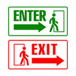


Image 36. Signs that everyone understands to indicate places in the garden of special importance.
If one decides to share more information about the garden such as explaining the purpose of a therapeutic garden or explaining the different modules, keep in mind to use a text that is easy to understand and read for everybody.
Examples and help to use easy language:
https://www.learningdisabilities.org.uk/learning-disabilities/a-to-z/e/easy-read
https://www.lecturafacil.net/es (Spain)
https://blogceapat.imserso.es/lectura-facil/ (Spain)
3. Vision impairment
Signage for persons with visual impairment is usually referred to as Braille text. It is always a good idea to include braille text if there are signs in the garden. For visually impaired persons, the pavements are very important. Through changes in textures and patterns they will be able to interpret where they are and for example, be aware of exits and entrances. To design for visual impairment is a well-designed therapeutic garden, giving special attention to contrasts, pavements, hand rails, clear pathway system and sensory stimulation.